In Data Marketing We Trust. Of Beauty and (Self-)Deception.
Leveraging big data in HR tech has become increasingly popular in recent years thanks to its great potential. However, the current benefits often lag behind the marketing promises of vendors. Because of the highly unstructured nature of job-related data and the numerous factors that influence jobs, skills and labor market dynamics, finding good quality data and analyzing it reliably is still a huge challenge. In addition, many of us aren’t quite as data savvy as we’d like to think. What’s more, as human beings we’re highly susceptible to certain phenomena; that vulnerability is often taken advantage of in marketing, especially in an industry that tends to promise more than it can deliver. We all fall prey to the crudest tricks and manipulations time and again; these cheap ploys simply work too well. So, in this post, we want raise awareness by taking a closer look at two of these phenomena: social proof and misleading data visualizations, and how they can be misused. Hopefully, after reading this, we will all ask ourselves next time whether those enticing numbers and pretty graphics really are trustworthy enough to use or share without thinking. Or if we really should buy that product just because 7 out of 10 companies of some type have already made the same mistake…
In people we trust
Imagine you’re on vacation, and you want to eat out at a restaurant. There’s this one place you’d read great things about and you want to try it out. But when you get there, it’s almost empty, and the restaurant next door (that you’d never heard of) is almost full. Which restaurant will you choose? Most likely the one that’s bustling. Why? Social proof. A term coined in 1984 by Robert Cialdini in his book Influence, social proof is also known as informational social influence. It describes the principle that when people are uncertain, they will typically look to others for behavioral guidance. This is based on the instinctive assumption that the (social) group displays optimal behavior to achieve the best possible outcome. One consequence of this, which is used excessively in marketing, is that our minds use social proof as a shortcut equating popularity with quality, trustability and other positive attributes. In fact, the effect of this phenomenon can be so powerful that any other indicators may be completely disregarded—no matter how contradictory. Basically, our minds are wired to crave efficiency, so any perceived shortcut is subconsiously strongly favored over the alternative of strenuous research and carefully weighing pros and cons.
Social proof comes in many forms from experts, celebrities, friends, customers, followers, etc. The thing is, at the risk of stating the obvious, social proof is not proof. For neighboring restaurants, it’s more about luck than marketing: Whoever gets the first few customers of the evening, wins. Even if the food is terrible. In marketing, there are many ways to obtain or reframe social proof for optimal effect.
Let’s say you’re considering a certain well-established data provider for your HR tech, and on the homepage of the provider’s website you see that “67 of the Fortune 100 companies look to” that company for their data needs. Then you’re likely to believe it will work well for you too. And anyhoo, no one ever got fired for hiring IBM, right? (Just to be clear: We’re not actually talking about IBM here.) Throw in some trigger words like uncertainty, need, trust and secure, and it may well be virtually impossible to resist the bait. Even if the data provider’s sole argument is that you can trust their data… because a few dozen other companies did. But what does “look to” even mean? Elsewhere on their website you may find that the 67 companies also include one-time consulting gigs (and “consulting” may be used very loosely) as well as past clients, i.e., clients who stopped using their services. The facts have been reframed to boost social proof. However, by the time you come across this tidbit, your brain may well already be so biased toward the provider that it refuses to adequately process any information that goes against what your brain wants to think. Hello, confirmation bias.

Now, social proof may get this company’s foot, or even an entire leg, in the door. But they’re a data provider, so they still need to sell you on their data. How? According to the research, with visualizations – especially if they’re pretty.
In beauty we trust
Visualization is an essential tool for analyzing and communicating data. Well-designed visuals can help people form a greater understanding of often vast amounts of highly complex data. However, there is a dark side to data visualizations, particularly when they are aesthetically appealing: Studies show that beautiful design significantly increases trust in the presented data. Not only that, but it seems that our trust bias in favor of beautiful visualizations cannot be reduced by better education or even specific knowledge of misleading visualization techniques. On top of that, studies like this one have shown that misleading visualizations are indeed highly deceptive. Of course, these misleading charts are often created with no ill intent by people who simply do not realize what they are doing. However, there are also many individuals and organizations who exploit these techniques because they have an agenda. Be it for financial, political or any other gain. Thus, in the hope that – despite scientific evidence to the contrary – raising awareness will lower your susceptibility to deception, here are five of the most common ways to misrepresent data and mislead audiences:
1. Manipulating the baseline
Truncating the y-axis is an easy way to exaggerate changes and differences. Sometimes, the resulting chart is so obviously wrong, it’s just silly (or offensive):
Source: https://twitter.com/reina_sabah/status/1291509085855260672
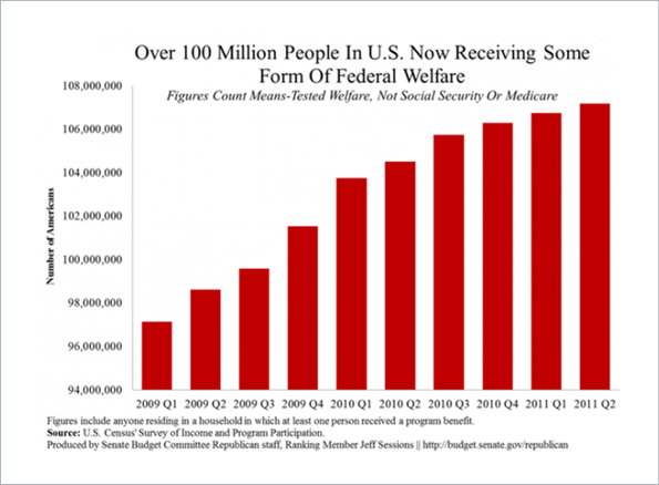
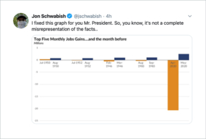
More often, though, the manipulation is not quite so obvious to the untrained eye or less critical reader, particularly if combined with a sensational headline. For example, the bar chart below – produced by the Senate Budget Committee Republican staff – gives the impression that the number of federal welfare recipients in the US is spiraling out of control. It looks like the number more than quadrupled over the course of two years.

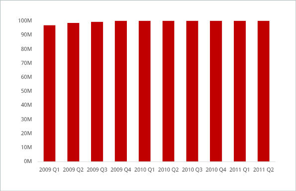
With the correct y-axis, shown below, one can see that the situation is far less dramatic.

In addition to the misleading visualization, the headline is misleading as well: The fine print at the bottom of the original chart states that the numbers include anyone living in a household in which at least one person received a program benefit. This includes individuals who did not themselves receive government benefits. On the other hand, the Survey of Income and Program Participation typically provides information on the number of households (not individuals), or on the number of individuals that either receive benefits from the program or are covered under someone else’s benefit (e.g. children). Since the source of the data is not stated clearly enough, it’s anyone’s guess as to what (or who) to trust here.
2. Manipulating the axes
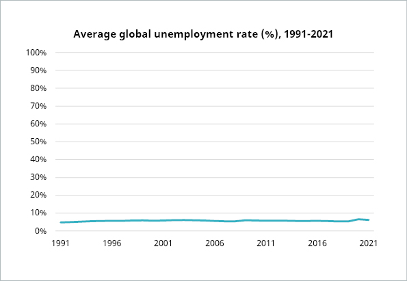
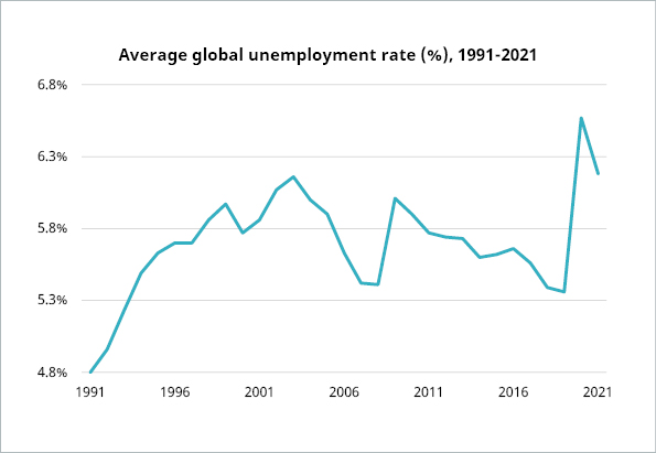
This visualization tactic of changing the scale of a graph is often used to minimize or maximize a change. For instance, the graph below shows the average global unemployment rate from 1991 to 2021. The scale goes from 0 to 100, i.e. all possible percentages. This doesn’t make sense for the data. Instead, it serves to flatten the line and convey the idea that the unemployment rate hasn’t changed much in the past 3 decades.

Data source : https://data.worldbank.org/indicator/SL.UEM.TOTL.ZS
Here’s the graph again with a more meaningful y-axis, showing quite a different dynamic.

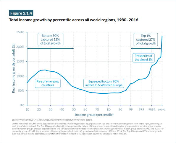
A more challenging example is the graph below from the World Inequity Report 2018, which illustrates the growth in global real income from 1980–2016.

The purpose of the graph is to show the distribution of growth across income brackets. It gives the impression that the high growth in the top income brackets is broadly distributed across the wealthier segment of the population. This is misleading. The top 1% of the population takes up only a quarter less space along the horizontal axis than the bottom 50% (or rather, the almost-bottom 40%: the horizontal axis starts at 10%). This is because the horizontal axis suddenly switches from a linear scale to a logarithmic scale: every 10% of the population is represented by the same distance along the axis. But once the graph reaches 99%, this changes abruptly to a logarithmic scale, in which smaller and smaller segments of the population take up equal width along the horizontal axis. At the far-right side of the graph, less than 0.001% of the population corresponds to a region the same size as used to represent 10% of the population across most of the graph.
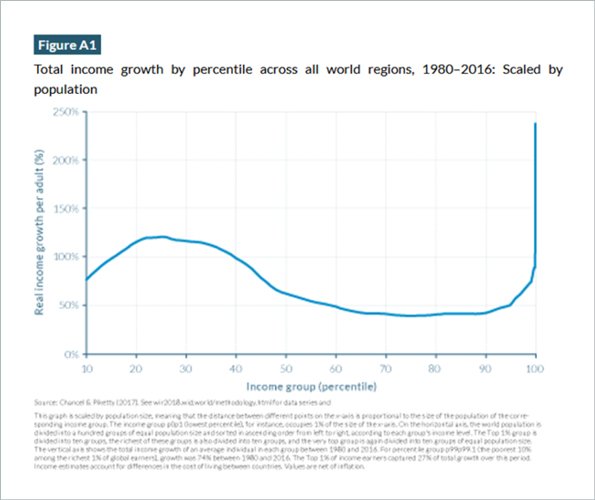
The alternative graph, buried in the appendix of the report and shown below, is plotted on a linear scale throughout.

This graph shows the distribution across income brackets much more clearly: it indicates relatively modest growth in income across the right half of the graph, concluding in a sharp increase for a very tiny fraction of the represented population.
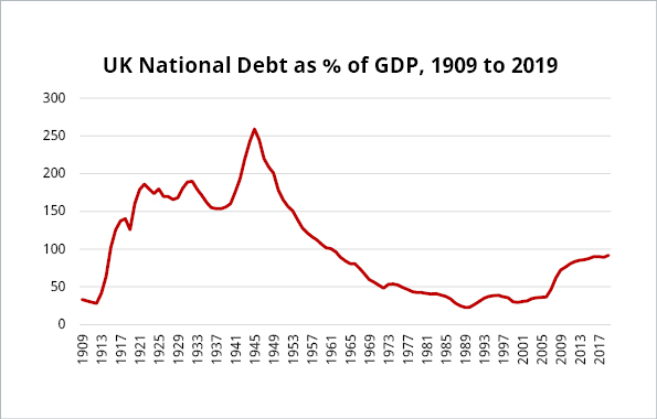
3. Cherry picking data
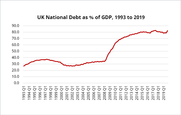
Cherry-picked data is probably the trickiest manipulation to spot, and particularly powerful. Shifting the data frame can create a very different story. For instance, if you wanted to create the impression of a debt crisis in the UK, you could post a graph like this which shows that UK public sector debt as a percentage of GDP has more than doubled since 2002. For an even more dramatic graph, you could post the total level of debt, which has increased even faster than debt to GDP.

However, if you place the growth in real debt to GDP in a broader context, say, by considering the data since 1900, the rise looks much more modest.

Data source: Bank of England – A millennium of macroeconomic data and ONS public sector finances HF6X.
And here’s an example from a veritable master of cherry picking – with an apt response:

Cherry picking, as all these techniques, can of course be done unintentionally. This very often occurs when people are affected by confirmation bias. We touched on this in one of our previous posts.
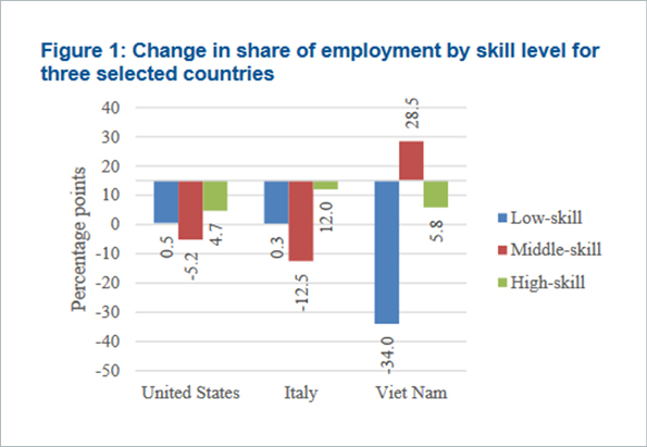
4. Going against conventions
This chart is from a UN report on job polarization. The bars are set at 15 as a baseline, and the length of each bar represents the value of the corresponding data point minus 15. I have no idea why this visualization was created in this way; it simply defies all logic, making it very difficult to read and completely distorting the data visually.

Here’s what the chart looks like when adhering to conventions.

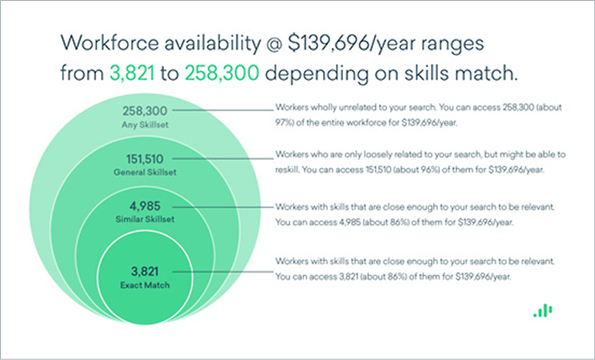
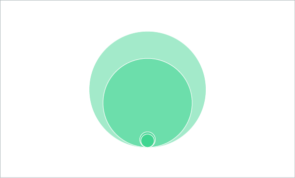
The following chart is not quite so confusing, but also goes against conventions. Proportional area charts are hard to read, especially ones with circles, and should be used sparingly. They are typically used to visualize the relative sizes of the data: each circle area is proportional to the value it represents. Going by the relative sizes of the circles in the chart below, the number of exact matches among all workers seems pleasingly high.

However, when you match the circle areas to the numbers, the finding the perfect (employee) match looks much more like the proverbial needle in a haystack.

And maybe this e-commerce shop should have opted for a more conventional visualization like the one a little further down…


5. Using the wrong visualization
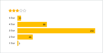
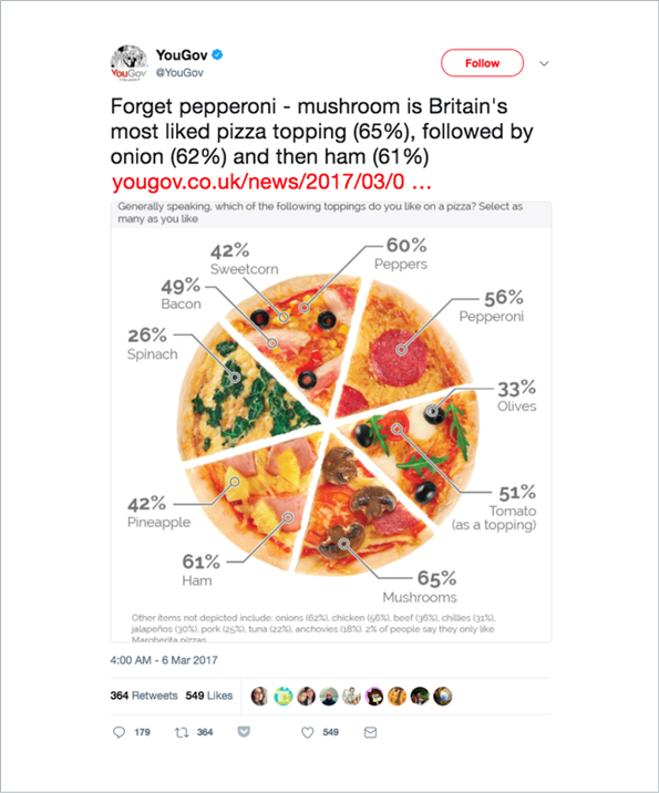
The classic and most obvious example of an inadequate visualization is the pie chart for values that do not add up to 100 percent, for instance, the results of a poll where participants can choose multiple answers. Just because a pizza is round like a pie does not mean this is a good way to show your results.

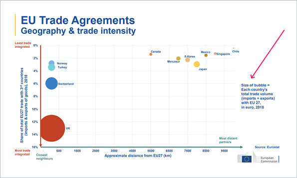
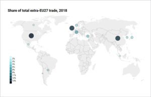
However, there are much more subtle or complex examples of using the wrong visualizations. In midst the so-called “slide wars” between the EU and the UK, where both sides traded PowerPoint-style slides to influence post-Brexit trade talks, the European Commission was accused of publishing a misleading graph which overstated the UK’s reliance on trade with Europe.
The European side used a large, red blob to highlight how much of Britain’s trade goes through the EU. Statisticians then pointed out that the graphic wildly exaggerated the relative size of Britain’s blob compared to that of other countries and blocs.

Source: https://ec.europa.eu/info/sites/default/files/cwp-20200218-trade-geography_en_0.pdf
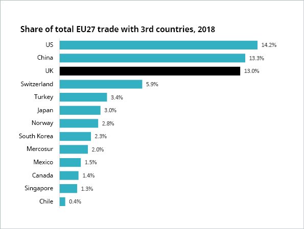
A European Commission spokesperson said: “The chart was generated with an Excel chart tool, based on data from Eurostat. The width of each bubble is proportionate to the total trade of each country.” Right there is one of the key problems: the convention is that the area of the bubbles is proportionate to the represented value – not the width. And this has been swept under the rug by using the ambiguous term size in the note on the chart. In addition, the size of the bubbles delivers no added value in terms of information because the two quantities share of total EU27 trade with 3rd countries and (absolute) total trade volume with EU27 are directly proportional. But the authors of this chart clearly have an agenda. This suspicion is further fueled by the fact that they have cherry picked the data: UK ranked #3 of EU trade partners, so they have conveniently excluded the top 2 partners US and China and instead included a seemingly random selection of trade partners from ranks 3 through 38. Another, albeit minor detail: the “approximate distance” is, well, very approximate.
Here’s the chart with the right bubble sizes and distances (and without the confusing colors).

However, one does wonder whether the approximate distances are truly necessary, or just complicate the chart. If you insist on geographical information, why not use a world map?
If you don’t need the geographics, the simplest visualization is often the best option.

But then again, it may not help your agenda. And it certainly won’t help you to “blind your readers with science” like the following example does very effectively.
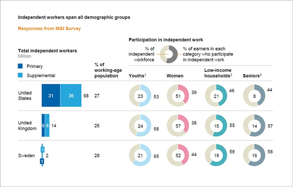
This is an excerpt from a table in a McKinsey report on independent work. Each row, representing a country, has 12 numbers squeezed into 6 columns. It’s too much data in one table and what’s more, the data is packed into mini charts that complicate the visualization without adding any informative value. It may look clever or cute to some. But it’s not. It’s intensely busy and confusing.

In data we trust
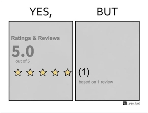
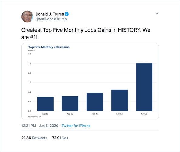
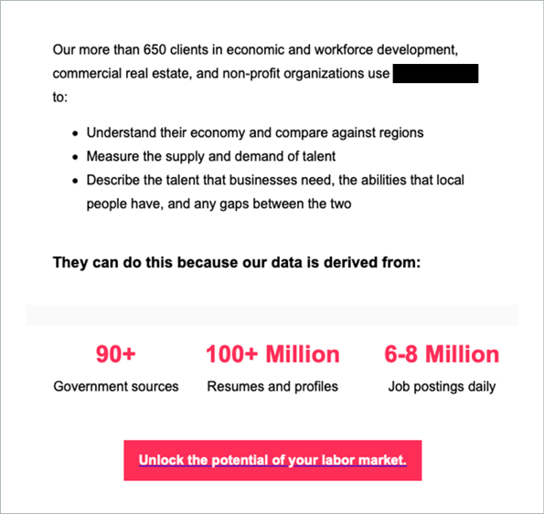
But we can’t blame everything on the visualizations. When it comes to data itself, many people still hold the misconception that more is more. That’s why marketing like this works:

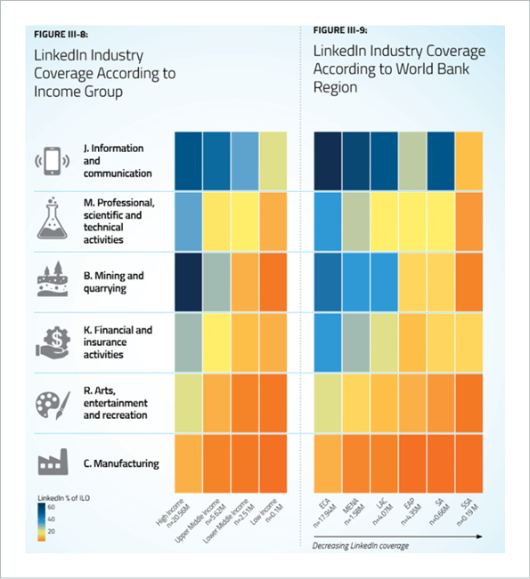
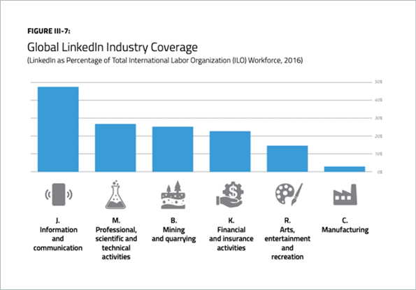
But here’s the thing. Contrary to popular belief, new data alone doesn’t necessarily equal new intelligence. Much of the gathered data lacks the quality needed to derive the promised insights. Especially unstructured data like resumes and online job postings. There’s whole slew of issues with this type of data, which you can read about in more detail in our series of posts here, here, and here. For now, we’ll take a brief look at two key concerns: This data is typically skewed towards certain industries, and overestimated in terms of usability. For instance, the World Bank Group partnered up with LinkedIn to investigate to what extent LinkedIn data can be used to inform policy. In their 2018 report, one can see that the data is highly biased toward the ICT industry and high-income countries.


Out of 17 ISIC industries, 12 had such low coverage that they had to be completely disregarded in the report, including the currently highly relevant industries human health and social work activities, transportation and storage, and accommodation and food service activities.
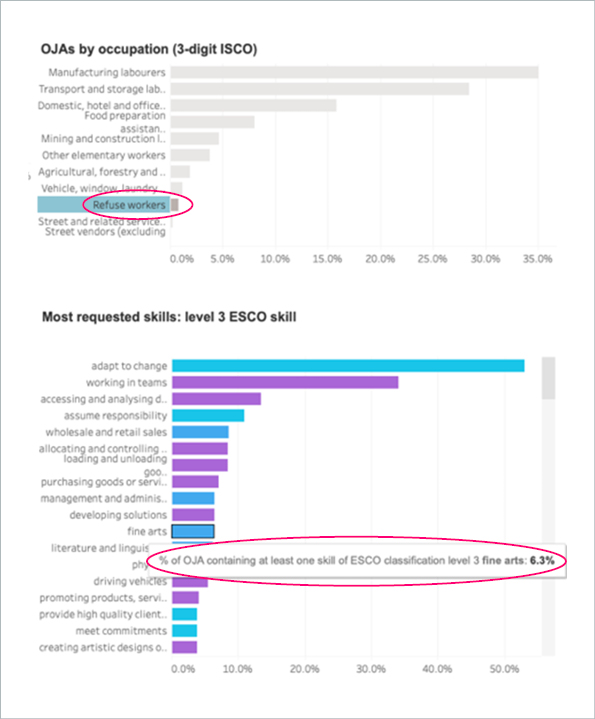
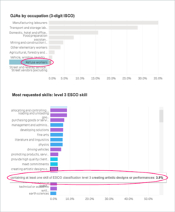
Skewed data is not the only issue. Rendering unstructured data machine-readable, for instance, by extracting and classifying skills, job titles and other relevant information, is extremely challenging and often faulty. Examples of this are abundant. For instance, the European project Skills-OVATE run by Cedefop and Eurostat provides publicly accessible data on skills and occupations extracted from online job postings across Europe. According to their 2021 data, knowledge of fine arts was requested in around 1 in 15 online job postings for refuse workers in Europe, and 1 in 25 ask refuse workers to create artistic designs or performances. Sounds like there is much more to being a refuse worker than most of us would assume..

(By the way, this system is set up and managed by the data provider in the marketing example above.)
You may brush this off as irrelevant. But once this data is in the system, it’s there to stay. And it leads to results like this:


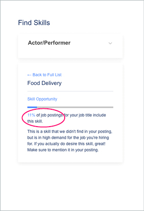
It’s hard to imagine that 11% of job postings for actor/performers include food delivery as a skill. If you want a less exotic example:

The suggested skills may not be quite as absurd as knowledge of fine arts, but they are just as irrelevant to refuse collection.
It would be wise not to attempt to “understand the economy”, “describe the talent that businesses need”, or “the abilities that local people have” using data of this quality. Instead of vast amounts of mediocre data, look for a sufficient amount of representative smart data: high-quality data that’s been validated and contextualized with intelligent annotations – ideally by humans, but that’s a whole other topic.
A final word: None of these data visualization and marketing tactics that we’ve covered here are inherently evil, or even necessarily wrong for that matter. Data visualizations are all about conveying the data’s story and like any other story, people can take artistic liberties. Handled with care, data itself can have many interesting stories to tell. But don’t let yourself be fooled into believing a story the data is not actually telling you.